I’ve seen too many people fall in love with mint green and then regret it six months later.
The color looks amazing in photos. But when you actually put it on your walls or bring it into your living room, something feels off. Either it looks like a 1950s diner or it takes over the entire space.
Here’s the thing: mint green works beautifully when you understand how to use it. But it fails fast when you don’t.
I’m going to show you how to incorporate mint into your home in a way that feels modern and intentional. Not trendy. Not dated. Just right.
This guide breaks down everything you need to know. Which colors work with mint. What materials pair well with it. How to use it in different rooms without making your space feel like a theme park.
We base this on core design principles that work. The kind that interior designers actually use when they’re creating spaces that last.
You’ll learn how to build a mint green color scheme that fits your home. Room by room. Step by step.
No guessing. No expensive mistakes.
Understanding the Psychology and Undertones of Mint Green
Mint green does something most colors can’t.
It makes a room breathe.
When I walk into a space painted mint, I notice the shift right away. The air feels lighter. Cleaner. Like someone just opened all the windows on a spring morning.
That’s not an accident. Mint carries associations we’ve built up over years. Fresh toothpaste. Cool water. New growth on plants. Our brains connect those dots without us even thinking about it.
But here’s where most people mess up.
They pick any mint off the shelf and wonder why it looks wrong in their room. The problem isn’t mint itself. It’s the undertones.
Mints with blue undertones lean cooler and crisper. They feel more modern. Almost clinical in the right light (which can work great in bathrooms or home offices).
Mints with yellow undertones go warmer and softer. They create that vintage vibe you see in retro kitchens and cozy bedrooms.
So which one should you pick?
Look at your natural light first. North-facing rooms get cooler light throughout the day. A mint with yellow undertones will balance that out and keep the space from feeling too cold. South-facing rooms flood with warm light, so a blue-based mint will add that crisp freshness without turning the room into a sauna.
Think about mood too. Want calm and airy? Go cooler. Want soft and welcoming? Go warmer.
And remember, what is the most important thing in interior design mintpalment teaches is this: test your paint samples on the actual walls. Watch them at different times of day.
Because the right mint can transform a room. The wrong one just looks like you couldn’t decide between blue and green.
Key Element 1: Perfect Color Pairings for Mint Green
Let me start with the basics.
Mint green works because it’s flexible. But that same flexibility trips people up. They see mint and freeze, unsure what to put next to it.
I’m going to walk you through the pairings that actually work.
Crisp and Clean with Neutrals
Pair mint with white and you get instant freshness. Think mint walls with bright white trim. Add soft gray furniture and suddenly you’ve got a room that feels both modern and timeless. In the vibrant world of game design, achieving a “Mintpalment” aesthetic can transform a virtual space into a refreshing sanctuary, where the cool tones of mint harmonize beautifully with crisp white accents, creating a visually stunning experience for players.
Beige softens the whole thing if white feels too stark. I’ve seen mint kitchen cabinets with beige countertops that look incredible (way better than you’d expect).
Bold and Dynamic with Contrasting Colors
Now, if you want personality, go bold.
Coral and mint? That’s a combo that makes people stop and look. Navy blue brings sophistication. Deep charcoal adds weight and drama.
These pairings create focal points. Your eye knows exactly where to land.
Soft and Serene with Pastels The ideas here carry over into Mintpalment Home Improvements by Myinteriorpalace, which is worth reading next.
For bedrooms and nurseries, I lean toward pastels.
Mint with blush pink creates this dreamy, gentle space. Soft lavender works too. Baby blue might seem redundant but it actually deepens the calm feeling.
This is what is the most important thing in interior design mintpalment when you’re designing for rest and relaxation.
Earthy and Grounded with Natural Tones
Here’s where mint surprises people.
Pair it with wood tones and tan leather. Add brass or gold accents. Suddenly mint doesn’t feel sweet or delicate anymore. It feels grounded and organic.
The natural materials balance out mint’s coolness.
Once you nail these pairings, you’ll probably wonder about proportions. How much mint versus how much of the other color? That’s what we’re covering next.
Room-by-Room Application Strategies

Let me walk you through how mint actually works in different spaces.
Because here’s what most people get wrong. They pick a color they love and slap it everywhere without thinking about how each room functions.
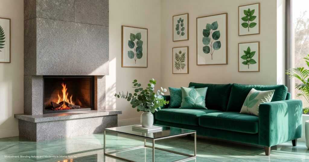
The Living Room
Start small if you’re nervous about commitment.
An accent wall behind your couch gives you that pop of freshness without overwhelming the space. I’ve seen it work beautifully in Spencer homes where natural light hits that wall in the afternoon.
Throw pillows are your safety net. You can test mint without painting a single wall. Mix them with cream or gray pillows and suddenly your couch looks like it belongs in a magazine.
Or go bold with a statement chair. That vintage armchair you found at a garage sale? Paint it mint and watch it become the conversation starter at every gathering.
The Kitchen
This is where mint really shines.
Paint your lower cabinets mint and keep the uppers white. It’s what is the most important thing in interior design mintpalment when you want that modern farmhouse vibe without going full shabby chic. For those looking to embrace a modern farmhouse aesthetic, the latest Kitchen Upgrading Tips Mintpalment emphasize the importance of balancing bold colors with classic whites to create a fresh and inviting space.
Not ready for cabinet painting? A mint backsplash does the trick. Subway tiles in a soft mint paired with white grout create that retro diner feel (but way more sophisticated).
Small appliances count too. A mint stand mixer or toaster adds personality without the commitment. Check out more ideas at kitchen upgrading advice mintpalment if you’re planning a bigger refresh.
The Bedroom
This room needs mint’s calming side.
Paint three walls a soft mint and leave one white for balance. Or flip it and do one mint accent wall behind your bed. Either way works.
Bedding is easier. Mint sheets with white pillowcases create that hotel feel. Add a chunky knit throw in cream and you’ve got texture that makes you want to climb in and stay there.
The key? Soft fabrics. Linen and cotton in mint feel restful. Synthetic materials can look cheap.
The Bathroom
Think spa, not sterile.
Mint subway tiles from floor to ceiling make a small bathroom feel bigger. The color reflects light better than you’d expect.
A mint vanity paired with a white vessel sink? That’s the move if you want something different from every other bathroom on your block.
White porcelain and chrome fixtures are your friends here. They keep mint from feeling too sweet or childish. The contrast makes everything look intentional.
Incorporating Texture and Materials
You can paint two rooms the exact same shade of mint and they’ll look completely different.
The reason? Texture.
Most people pick a color and slap it on the wall without thinking about finish. But here’s what happens. A matte mint absorbs light and feels soft and calm. Semi-gloss bounces light around and suddenly that same color looks brighter and more energetic.
I usually go with eggshell for walls. It gives you just enough sheen without feeling too slick.
Now let’s talk about layering mint through fabrics.
This is where things get interesting. A velvet mint pillow feels rich and moody. Linen curtains in the same shade? Light and breezy. The color stays the same but the vibe shifts completely.
I like mixing cool mint with warm textures. It creates tension in a good way (the kind that makes a room feel put together instead of flat).
Some people say mint only works in soft applications. That you should keep it subtle and safe.
But I disagree.
I’ve seen mint ceramic lamps that become the focal point of a room. A painted front door in mint makes your whole house feel fresh before anyone steps inside. Decorative glass in mint catches light in ways paint never will.
And here’s a trick. Pair mint with warm metals like copper or brushed gold. The contrast makes both elements pop without fighting each other.
That’s what is the most important thing in interior design mintpalment taught me. Materials matter as much as color choice.
Common Mint Green Mistakes to Avoid
I see these mistakes all the time.
Over-saturation happens when you paint every wall mint and add mint pillows and mint curtains. It’s too much. You need to break it up with whites or grays (or even a bold navy if you’re feeling brave).
Ignoring undertones is where most people trip up. You grab a blue-toned mint and pair it with a warm cream. They fight each other. The room feels off and you can’t figure out why. When seeking harmony in your design, keep in mind the crucial Kitchen Upgrading Advice Mintpalment, as neglecting undertones can lead to an unsettling clash between colors like a blue-toned mint and a warm cream.
Forgetting texture makes your space feel flat. All smooth mint surfaces with no variation? That’s boring. Mix in some linen or wood or even concrete.
Want to know what is the most important thing in interior design Mintpalment? Balance. You can check out more kitchen upgrading tips mintpalment for practical examples.
Designing with Confidence
You now have everything you need to work with mint green.
I know the fear of making a space look dated or stuck in the wrong decade. That worry stops a lot of people before they even start.
But you’re past that now.
You understand undertones. You know which colors work together and which ones fight. You’ve learned how to layer textures so mint feels modern instead of outdated.
This is how you create a space that feels both refreshing and timeless.
Here’s what I want you to do: Pick one room. Choose a single mint element to start with. Maybe it’s a throw pillow or a small accent wall.
That’s it.
You don’t need to overhaul everything at once. Start small and see how it transforms the space.
The tools are in your hands now. You can design with precision instead of guessing.
Your space is waiting.
 Thero Zolmuth is the kind of writer who genuinely cannot publish something without checking it twice. Maybe three times. They came to gardening tips and ideas through years of hands-on work rather than theory, which means the things they writes about — Gardening Tips and Ideas, Home Improvement Strategies, Interior Decorating Essentials, among other areas — are things they has actually tested, questioned, and revised opinions on more than once.
That shows in the work. Thero's pieces tend to go a level deeper than most. Not in a way that becomes unreadable, but in a way that makes you realize you'd been missing something important. They has a habit of finding the detail that everybody else glosses over and making it the center of the story — which sounds simple, but takes a rare combination of curiosity and patience to pull off consistently. The writing never feels rushed. It feels like someone who sat with the subject long enough to actually understand it.
Outside of specific topics, what Thero cares about most is whether the reader walks away with something useful. Not impressed. Not entertained. Useful. That's a harder bar to clear than it sounds, and they clears it more often than not — which is why readers tend to remember Thero's articles long after they've forgotten the headline.
Thero Zolmuth is the kind of writer who genuinely cannot publish something without checking it twice. Maybe three times. They came to gardening tips and ideas through years of hands-on work rather than theory, which means the things they writes about — Gardening Tips and Ideas, Home Improvement Strategies, Interior Decorating Essentials, among other areas — are things they has actually tested, questioned, and revised opinions on more than once.
That shows in the work. Thero's pieces tend to go a level deeper than most. Not in a way that becomes unreadable, but in a way that makes you realize you'd been missing something important. They has a habit of finding the detail that everybody else glosses over and making it the center of the story — which sounds simple, but takes a rare combination of curiosity and patience to pull off consistently. The writing never feels rushed. It feels like someone who sat with the subject long enough to actually understand it.
Outside of specific topics, what Thero cares about most is whether the reader walks away with something useful. Not impressed. Not entertained. Useful. That's a harder bar to clear than it sounds, and they clears it more often than not — which is why readers tend to remember Thero's articles long after they've forgotten the headline.