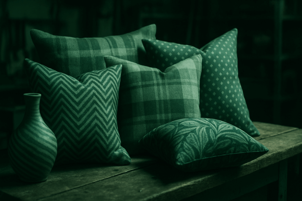
How to Use Color to Anchor Bold Patterns
When working with bold patterns, your choice of color isn’t just a decoration—it’s a design strategy. A well-chosen palette helps tie together vibrant prints, making your overall space feel intentional rather than chaotic.
Start with 2–3 Anchor Colors
Instead of letting patterns pull your space in too many directions, choose two to three base colors that will guide your design decisions.
- Select hues that appear in multiple elements across your room (e.g., upholstery, artwork, or rugs)
- Stick to shades that reflect your personality but also offer versatility
- Use one dominant color and two complementary or accent hues
Make Patterns Work With, Not Against, Your Palette
Bold doesn’t have to mean busy. The right color choices can turn visual noise into visual flow.
- Choose patterns that incorporate one or more of your anchor colors
- Limit competing tones to avoid overwhelming the space
- Use patterns to add energy—without disrupting harmony
Color Unifies Bold Design
When color is consistent, even contrasting patterns can feel like they belong together.
- Stripes, florals, geometrics—they all work if tied to your color story
- Repeating color across fabrics, furniture, and accessories builds coherence
Want More Tips?
Check out this guide for a deeper dive into cohesive color design: How to Create Harmonious Color Palettes in Your Home
Layering visual interest isn’t just for interior design blogs—it’s a low-key powerhouse move in vlogging too. When done right, pattern and texture don’t just make a frame look good; they build atmosphere. A faded denim jacket, a brick wall, a plant’s shadow slanting across a desk—these things create mood without saying a word.
Pattern and texture add weight and warmth to your content. They make your space feel lived-in, even if it’s a corner of a studio apartment. Layered visuals help tell your story without relying on graphics or edits. That’s the kind of subtle depth today’s audiences notice, even if they don’t immediately point it out.
Where creators mess this up is overloading the frame. Too many competing patterns, buzzword props, or random colors can turn your video into a visual migraine. Keep it simple: textured neutrals, a few well-placed items, and a backdrop that supports, not distracts. Let the eye rest—then draw it to what matters most: you.
Pairing Patterns: Scale Over Scatter
When it comes to visual storytelling in vlogs—or even thumbnails and channel branding—pattern pairing is subtle, but powerful. Start with one large-scale pattern that sets the tone visually. Think: bold backgrounds, oversized text overlays, or a prominent framing device that repeats across your content. Then, layer in one or two smaller patterns to build visual texture. It could be your consistent use of lower thirds, subtle animation styles, or even a recurring prop or backdrop.
The goal isn’t to flood the audience with visual tricks. It’s to give their eye a place to land—and a reason to keep watching. Scale matters more than packing in quantity. Too many competing elements create noise. A strong primary pattern signals intention. Supporting patterns add rhythm without disruption.
Visual hierarchy is non-negotiable. It’s your silent guide, leading the audience from thumbnail to title to the first five seconds of footage. Nail this, and your brand feels cohesive, even before you say a word.
Clashing patterns used to be a gamble—now they’re a strategy. Stripes with florals, geometrics with organic textures: high-contrast pairings bring energy and edge when they’re intentional. It’s not about chaos; it’s about friction that adds interest. Viewers don’t just watch your vlog for what you say—they watch for how your frame looks. A well-styled background or outfit that plays with bold opposites draws the eye without needing to shout.
The trick is balance. Contrast works best when you mix texture and line wisely. Hard stripes soften when layered under fluid prints. Clean geometry builds structure around more chaotic visuals. Think of it like sound mixing—you’re not just throwing notes together, you’re tuning them to create flow.
Avoid going overboard in the name of ‘eclectic.’ Three patterns competing for attention, plus color overkill? That’s noise. Go for intentional mismatch—one bold element, one supporting, and one neutral. Let each piece breathe.
Visual storytelling is part of vlogging in 2024. Pattern contrast, when used right, doesn’t just make the grid look better. It helps you stand out without having to scream for attention.
Texture is doing the heavy lifting where pattern steps back. In 2024, vloggers and set designers alike are leaning into tactile variety to keep visuals rich. Matte, woven, glossy, and rough—each finish brings its own energy, adding low-key drama to any frame. You don’t need loud prints to catch the eye when touchable contrast does the job.
Layering is part of the equation too. A velvet couch paired with a chunky knit throw hits differently on camera. It works in real life, and it works on screen. These simple contrasts create visual interest without trying too hard.
Want a neutral space that doesn’t read flat? Mix your finishes. A matte wall, glossy ceramics, raw wood, and soft linen can play nice together. It’s about tension and balance. Subtle, yes—but boring? Never. Especially not when the camera starts rolling.
Neutral Patterns: The Creator’s Secret Weapon
When it comes to visual design—whether in thumbnails, set design, or on-camera outfits—neutral patterns can quietly enhance your brand without stealing the spotlight. Used wisely, they make your content feel more polished and intentional while keeping the focus where it belongs: on you and your message.
Why Neutral Patterns Work
Neutral patterns are versatile tools that add visual interest without overwhelming your audience. They’re subtle, adaptable, and—most importantly—they help establish consistency across your content.
- Blend seamlessly with most color palettes
- Don’t compete with other visual elements on screen
- Give your content a unified, cohesive look
Think in Rhythms and Repeats
When incorporating patterns, skip the matchy-matchy mindset. Instead, focus on creating rhythm and visual flow. Patterns that echo or repeat can create a pleasing sense of movement or balance on screen.
- Repeating stripes or simple geometric shapes create stability
- Use background elements, props, or wardrobe to reflect subtle patterns
- Think in sequences rather than perfect symmetry
The Power of Odd Numbers
A simple design principle: groups of 3 or 5 feel visually dynamic. Whether you’re arranging visuals on a set wall, showcasing product shots, or layering elements in a thumbnail—odd numbers generally feel more organic and less forced.
- Three visual elements can guide the viewer’s eye across the frame
- Five gives balance while still offering complexity
- Avoid fours—and even numbers in general—as they can appear too rigid
Neutral patterns aren’t just stylish—they’re smart. Use them strategically in your visuals to enhance your brand’s personality and create a more professional, viewer-friendly aesthetic.
Soft furnishings are your safest testing ground. Cushions, rugs, curtains, throws—these are the low-commitment items where you can push a color or texture without fully committing. Try that burnt orange or dramatic pattern here before you repaint a wall or buy a statement couch.
The key is to add slowly. Layer a few things, live with them for a week. Feel the space. Are you gravitating toward it more? Or does something start to feel off? That pause between layers gives you time to know what actually works.
And if it starts to feel cluttered, chaotic—or just not you—pull back. Trust your gut. Editing is part of styling. Sometimes subtracting one item sharpens everything else. There’s no prize for having the most throw pillows.
Mixing patterns and textures isn’t just about visual interest—it’s about staking your style. It’s part skill, part gut instinct. Plaid over stripes? Denim on denim? Velvet next to techwear? It can work—but only if you commit.
This is where practice does the heavy lifting. Try combos that feel wrong. Look again. Adjust. Sometimes you need to break it to see the flow. Step back and hunt for balance—not symmetry. Personality always trumps perfection here.
The real art is knowing when enough is enough. Let one element lead, then add layers that push it just far enough. This isn’t about chaos—or playing it safe. It’s rhythm, with a bit of rebellion. If it tells your story, wear it.
 Daniel Cartersonicser is the kind of writer who genuinely cannot publish something without checking it twice. Maybe three times. They came to diy renovation projects through years of hands-on work rather than theory, which means the things they writes about — DIY Renovation Projects, Home Improvement Strategies, Home Design Updates, among other areas — are things they has actually tested, questioned, and revised opinions on more than once.
That shows in the work. Daniel's pieces tend to go a level deeper than most. Not in a way that becomes unreadable, but in a way that makes you realize you'd been missing something important. They has a habit of finding the detail that everybody else glosses over and making it the center of the story — which sounds simple, but takes a rare combination of curiosity and patience to pull off consistently. The writing never feels rushed. It feels like someone who sat with the subject long enough to actually understand it.
Outside of specific topics, what Daniel cares about most is whether the reader walks away with something useful. Not impressed. Not entertained. Useful. That's a harder bar to clear than it sounds, and they clears it more often than not — which is why readers tend to remember Daniel's articles long after they've forgotten the headline.
Daniel Cartersonicser is the kind of writer who genuinely cannot publish something without checking it twice. Maybe three times. They came to diy renovation projects through years of hands-on work rather than theory, which means the things they writes about — DIY Renovation Projects, Home Improvement Strategies, Home Design Updates, among other areas — are things they has actually tested, questioned, and revised opinions on more than once.
That shows in the work. Daniel's pieces tend to go a level deeper than most. Not in a way that becomes unreadable, but in a way that makes you realize you'd been missing something important. They has a habit of finding the detail that everybody else glosses over and making it the center of the story — which sounds simple, but takes a rare combination of curiosity and patience to pull off consistently. The writing never feels rushed. It feels like someone who sat with the subject long enough to actually understand it.
Outside of specific topics, what Daniel cares about most is whether the reader walks away with something useful. Not impressed. Not entertained. Useful. That's a harder bar to clear than it sounds, and they clears it more often than not — which is why readers tend to remember Daniel's articles long after they've forgotten the headline.